Creating a peaceful and relaxing atmosphere in your home often starts with the colors you choose for your walls and decor. Calm colors can help reduce stress, improve mood, and make your living spaces feel welcoming. Whether you’re refreshing a single room or redecorating your entire home, selecting the right colors is key. This guide offers practical tips for choosing calm colors that will help you create a soothing environment.
Why Choose Calm Colors for Your Home?
Colors influence how we feel. Bright, intense hues stimulate energy and excitement, while calm colors encourage relaxation and comfort. By using soft, muted tones or gentle shades, you can set a peaceful mood ideal for resting, focusing, or simply unwinding after a long day.
Understanding Calm Colors
Calm colors often fall into these categories:
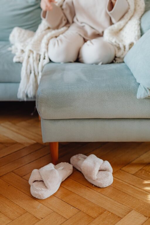
– Neutrals: Soft whites, beiges, greys, and taupes provide a versatile and gentle backdrop.
– Pastels: Light shades of blue, green, lavender, and pink offer subtle color without overwhelming the senses.
– Earth tones: Soft browns, muted greens, and warm clay shades connect your space with natural elements, promoting tranquility.
Tips for Choosing Calm Colors
1. Consider the Room’s Purpose
Different rooms benefit from different calming colors. For example:
– Bedroom: Soft blues and lavenders promote sleep and relaxation.
– Living Room: Warm neutrals and gentle greens encourage comfort and conversation.
– Home Office: Muted greens and soft greys help with focus without feeling sterile.
Think about how you plan to use the room and choose colors that support that activity.
2. Test Colors in Natural Light
Colors can look very different depending on lighting conditions. Always test paint samples on your walls and observe them at different times of the day — morning, afternoon, and evening. Natural light can enhance the softness of calm colors, while artificial light might change their tone.
3. Use a Color Palette
Select a harmonious color palette with two or three calm shades that complement each other. This ensures a cohesive look throughout the room while adding subtle variation. Use a color wheel tool, or seek inspiration from nature, like a soft beach scene or a forest in mist.
4. Balance Color with Texture
Sometimes calm colors can look flat or dull if used alone. To make the space feel inviting, combine calm paint colors with rich textures — soft fabrics, woven rugs, linen curtains, or wooden furniture. These textural contrasts add warmth and depth without overpowering the calm color scheme.
5. Go for Matte or Satin Finishes
Glossy and shiny paint finishes tend to reflect light and draw attention, which might detract from a serene atmosphere. Choose matte or satin finishes to keep walls soft and understated.
6. Use Color to Highlight Architectural Features
If your home has interesting moldings, trims, or built-in shelves, paint these accents in a slightly lighter or darker calm shade. This subtle contrast adds dimension without disturbing your overall calm color scheme.
7. Stick to Calming Color Psychology
Some colors have specific effects on mood:
– Blue: Reduces anxiety, lowers heart rate, and encourages calmness.
– Green: Promotes balance and harmony, often associated with nature.
– Lavender: Light purple tones bring gentle relaxation.
– Beige and soft greys: Neutral and comforting, they pair well with almost any color.
Using these colors purposefully will enhance your home’s soothing vibe.
8. Avoid Overly Dark or Intense Shades
Even within traditionally calming color families, very dark or saturated tones can feel heavy or dramatic. If you love deep blue or forest green, consider using them as accent colors in cushions, throws, or artwork rather than on large wall surfaces.
Final Thoughts
Choosing calm colors for your home is a wonderful way to create a space that feels welcoming and relaxing. Keep your room’s function in mind, use natural light to your advantage, and balance colors with texture for the best results. With thoughtful choices, your home can become a peaceful haven where you can recharge and enjoy everyday moments.
Remember, calm colors don’t mean boring — they simply invite you to slow down and feel at ease. Happy decorating!